Alaska Airlines unveils major brand updates
Share
In January 2016, Alaska Airlines revealed the most substantial updates to its brand in a quarter century, streamlining its wordmark and adding pops of color around its iconic tail design.
Today Alaska Airlines revealed the most substantial updates to its brand in a quarter century.
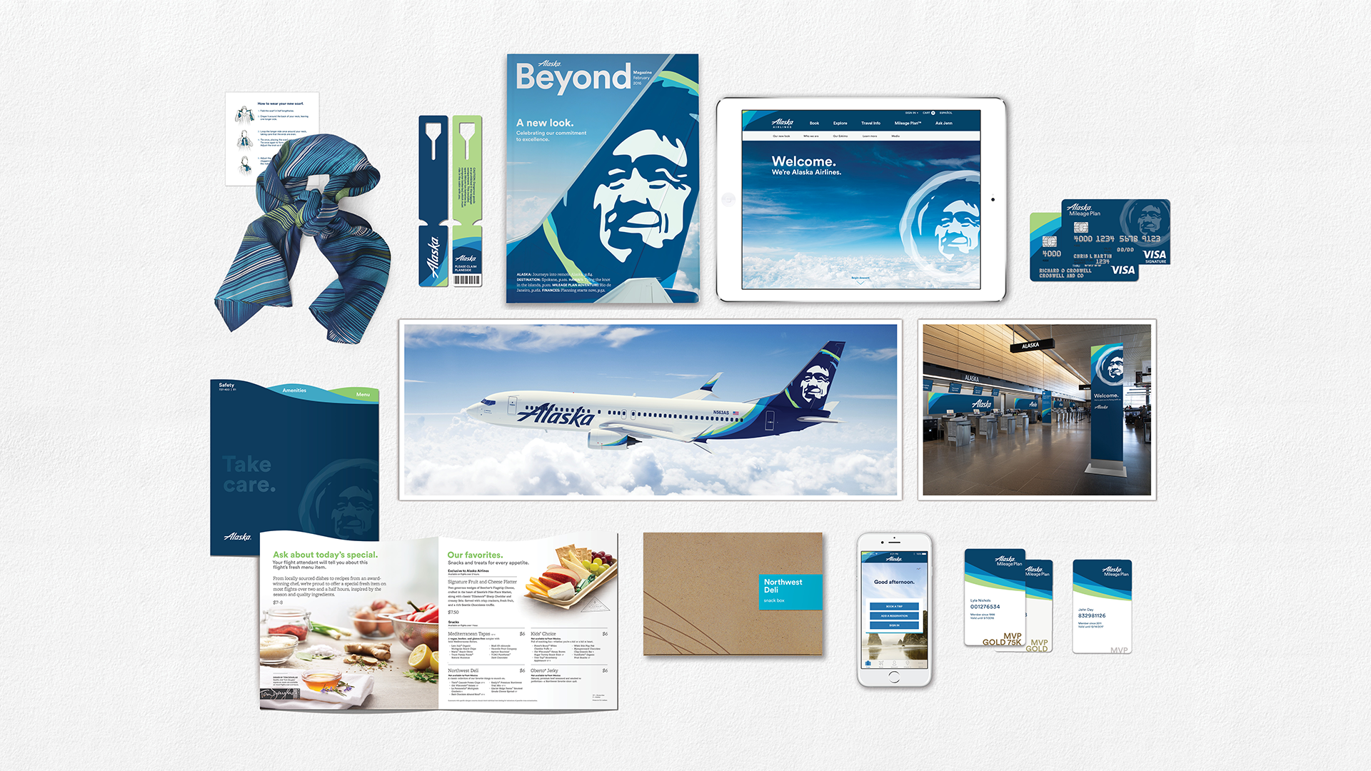
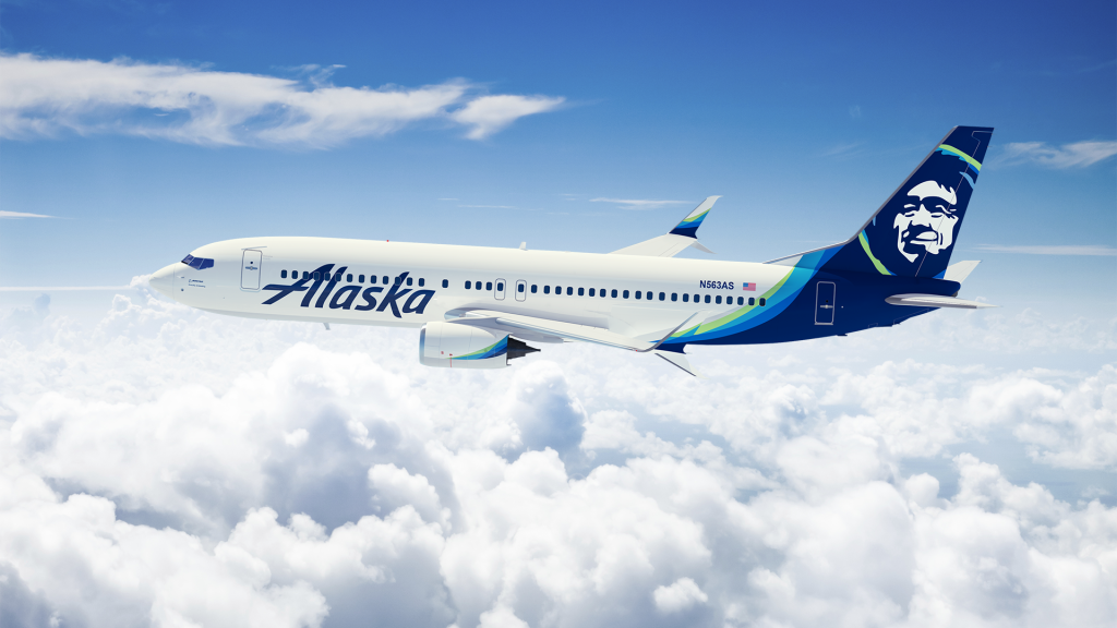
Beginning today, and throughout the rest of 2016, Alaska fliers will see the visual updates in new signage at the airport, an all-new airplane paint job, a refreshed website and mobile app, and more.
“We’ve always been a company about genuine, caring service. Our values are staying the same, but it’s time for our brand to show up bigger,” says Sangita Woerner, Alaska’s vice president of marketing. “We’ve added 90 new markets in the past five years. As we continue to grow, we are updating the outward expression of our brand so it shows up bolder wherever we fly.”
The visual changes unveiled today are the culmination of a number of cabin enhancements the carrier has made in the past year, which include free entertainment and premium just-released Hollywood movies, Tom Douglas signature onboard entrees and seatback power.
“Our brand is our reputation and who we are as a company. The logo and identity, those are the outward expression of our strong commitment to our customers,” said Woerner.
What’s changing?
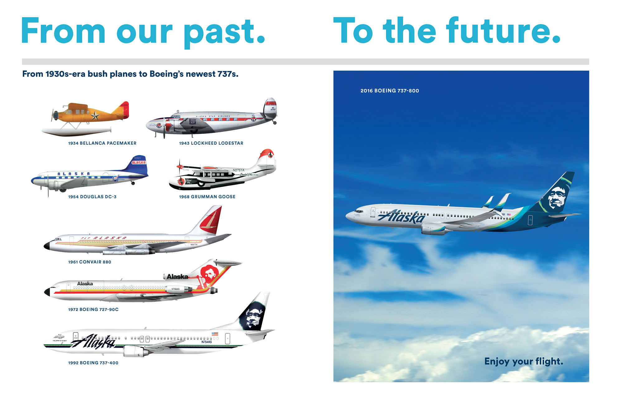
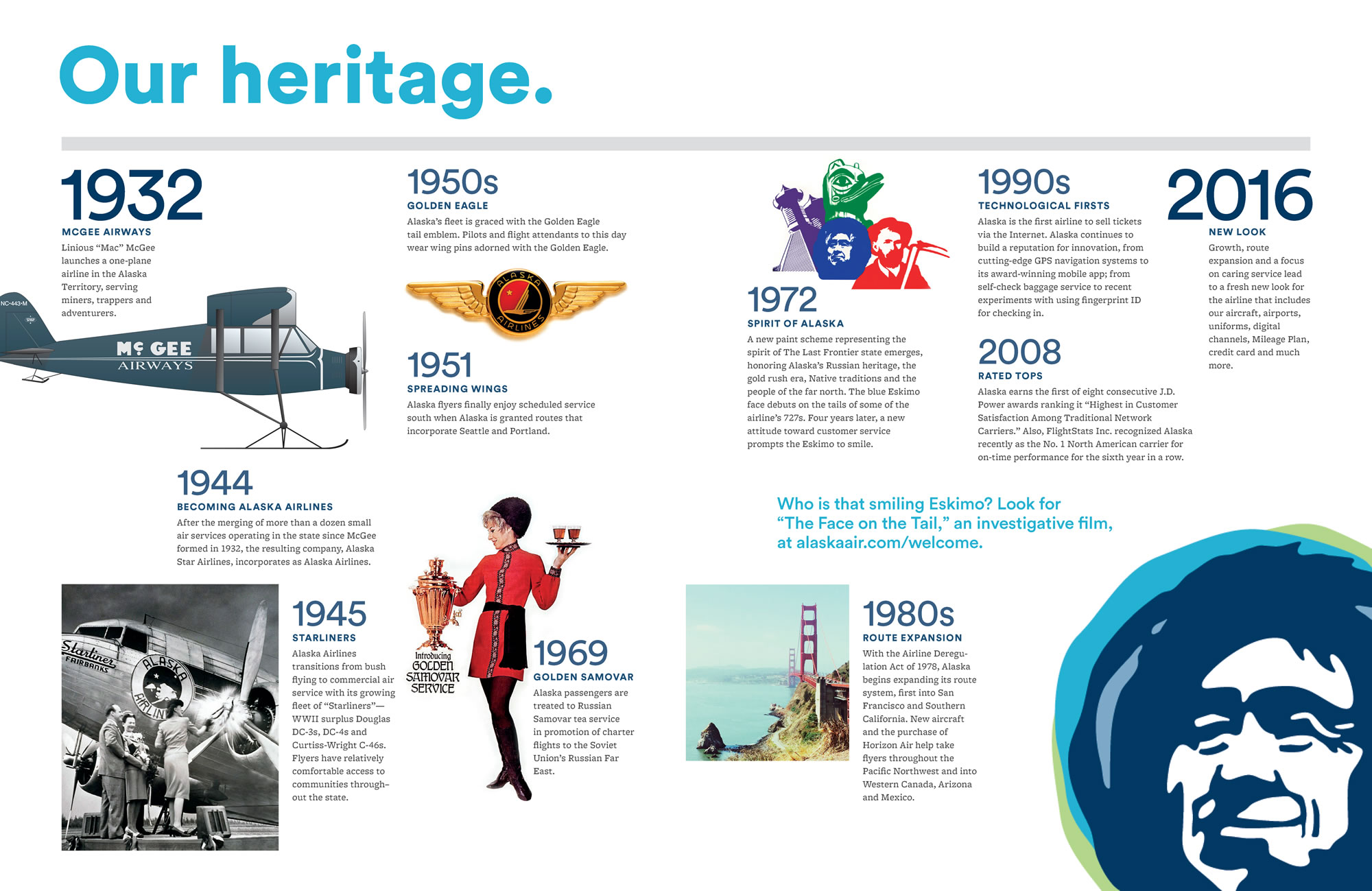
The two biggest changes to Alaska’s visual identity are in the bold new design of its name (or wordmark), and the iconic tail that has graced the tails of its planes since the early 1970s.
To the uninitiated, the updated wordmark may seem like a simple matter of font choice, but to Woerner’s team every stroke conveys something critical about the brand.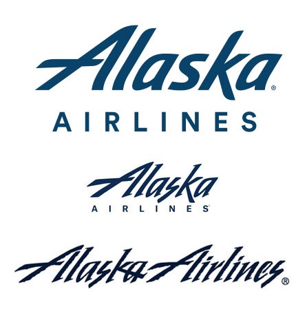
“The clean lines and italics of our updated wordmark represent the performance and precision our customers have come to expect when they fly Alaska, from our pioneering 20-minute baggage guarantee to our industry leading on-time performance,” said Woerner.
It was also important to the company to keep some equity from the wordmark that Alaska’s customers have come to know. The capital “A” in Alaska has been streamlined, but is otherwise very similar to earlier versions.
“It was a balance between taking what makes us who we are, and finding a way to modernize it with energy, life and confidence.”
In 2013, the marketing team traveled to the airline’s namesake state to interview native artists. Their goal: modernize the logo, while paying respect to all that he represents to the company and its people.
“He’s a great ambassador,” said Perry Eaton, an Alutiiq artist consulted for the project. “I see that logo and that image as being extremely important as an ambassador for the indigenous people of Alaska. It’s a touchstone.”
One new challenge unique to the digital age: the tail logo of the 1990s was too detailed to render well online and on mobile devices. The team smoothed and simplified his features and expanded his ruff to include pops of color. They gave the colors descriptive names to denote the places Alaska flies and the feelings the colors should evoke: “tropical green” for Hawai’i and Costa Rica and Alaska’s many international Mileage Plan destinations, and a palate of soothing blues: “breeze, midnight, atlas and calm.”
“Our goal was to bring more energy to the brand, so we brought color that represents the places we fly and our home here in the Pacific Northwest,” said Woerner. “We’re a brand that’s all about brightening your day, so we added some complimentary blues and green to reflect that in our outward appearance.”
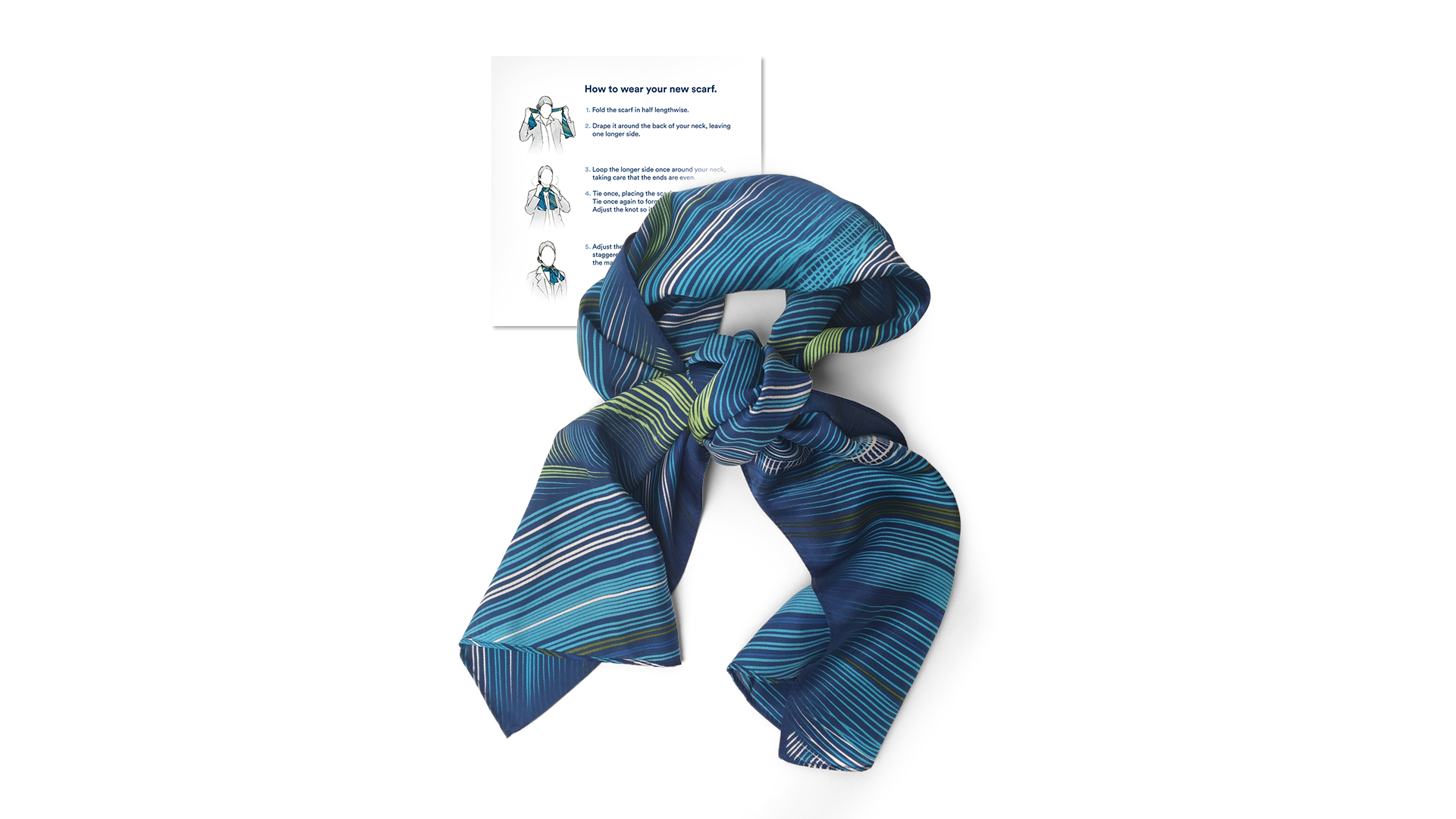
Customers will see vibrant new colors in the fur-lining of the updated Alaska Native’s parka, as well as in airports, onboard flights and online.
“[The changes are] subtle,” said Alutiiq artist Alvin Amason, who shares a studio with Eaton and was also consulted by Alaska Airlines. “You haven’t revamped it – you’ve made it ‘today’.”
In focus groups before the brand updates, fliers unfamiliar with Alaska described its look as “corporate, functional and a bit cold.” The simple changes of streamlining the “icicle font” in the wordmark and adding green began to dramatically change people’s first impressions of the brand.
“This sets us up for future growth,” Woerner said. “We’re a fiercely independent company, and we’re updating our brand to take us into the future.”
For media: Images and downloadable b-roll available here.